(Convergence Chart)
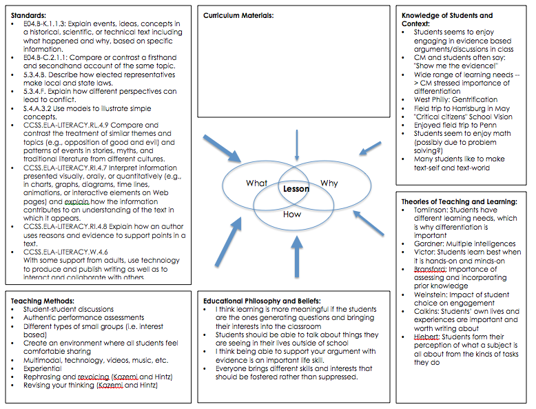
A “convergence chart” is the graphic representation of the different influences that have helped you define your curriculum plans. While this chart will inevitably include something about what is mandated for you to teach, your convergence chart should also explain why--given what you know about the community--it makes sense to study this topic. What funds of knowledge will you build your curriculum around? What other aspects of what you know about the community--inside and outside the classroom--lead you to propose this topic? Inevitably, some influences will be stronger than others. Note the power of these influences on your decision-making by varying the size of these arrows, as these may vary from school to school--at some schools the mandated curriculum may have a strong influence, at others, parental concerns maybe of greater importance.
(Final Convergence Chart: March 7, 2015)
(Second Draft Convergence Chart: February 6, 2015)
(Feedback from Andy: February 10, 2015)
Have you decided what the central topic of your unit is? Is it multiple perspectives? I'm feeling that there is a lack of focus that undermines your coherence. We should talk tonight or sometime before Friday's class so you'll be able to get more out it (you'll have time to develop the project). Let me know when you have updated your curriculum materials so I can provide comments on that.
